
Two-tone kitchen cabinets — two different cabinet colors in one kitchen — went from designer trick to mainstream in just a few years. And unlike most fast-moving trends, this one deserves its staying power. Done right, two-tone adds depth, personality, and a custom-designed feel for barely more than a single-color kitchen costs.
Done wrong, it looks like you couldn’t decide. The difference is a handful of design rules, which is exactly what this guide covers: the best color combinations, where to put each color, the rules that make it work, and the mistakes that make it fail.
What Are Two-Tone Kitchen Cabinets?
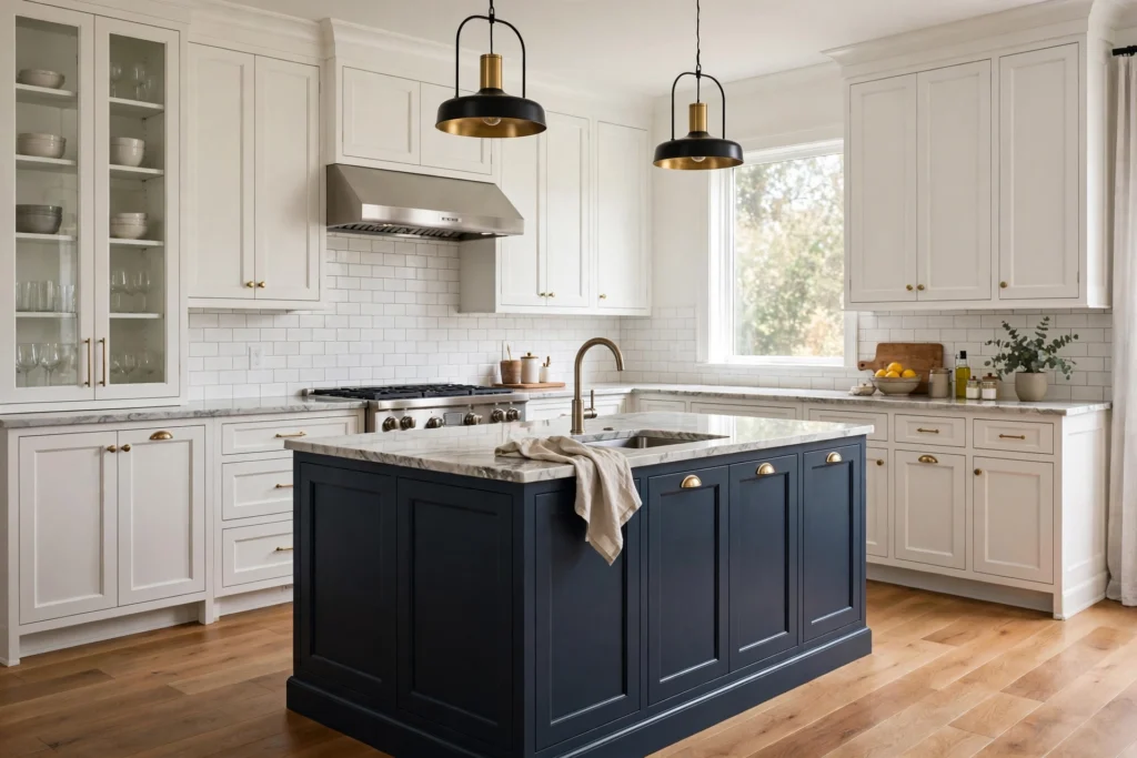
Simply: cabinets in two different colors or finishes within the same kitchen. The most common execution is a contrasting island (navy island, white perimeter), but two-tone also includes contrasting upper and lower cabinets, a different color on a pantry wall or hutch section, and mixed wood-and-paint combinations.
It’s not new — farmhouse kitchens have mixed painted and wood cabinets forever — but the deliberate, designed two-tone kitchen as a mainstream choice is recent. It caught on because it solves a real problem: how to have color and personality without committing the entire kitchen to a bold choice.
My honest take: two-tone is the best risk-management strategy in kitchen design. You get the navy/graphite/wood-tone drama you want, but 70% of the kitchen stays safe and bright. It’s having your cake and eating it — and it usually costs only a few hundred dollars more than a single-color kitchen (a two-finish upcharge), which makes it one of the cheapest high-impact upgrades available.
The Design Rules That Make Two-Tone Work
Rule 1: One color dominates. The 70/30 rule — roughly 70% of cabinets in the main color, 30% in the accent. A kitchen that’s 50/50 two colors looks indecisive; 70/30 looks designed. The dominant color is almost always the lighter or more neutral one.
Rule 2: Dark goes low, light goes high. Dark colors feel heavy; light colors feel airy. Dark lowers + light uppers = grounded but bright. Reversing it (dark uppers, light lowers) feels top-heavy and wrong — there’s a reason you almost never see it.
Rule 3: The island is the accent, not the perimeter. A contrasting island is a focal point; a contrasting perimeter with a matching island is just… confusing. Anchor the room with the perimeter color, make the island the star.
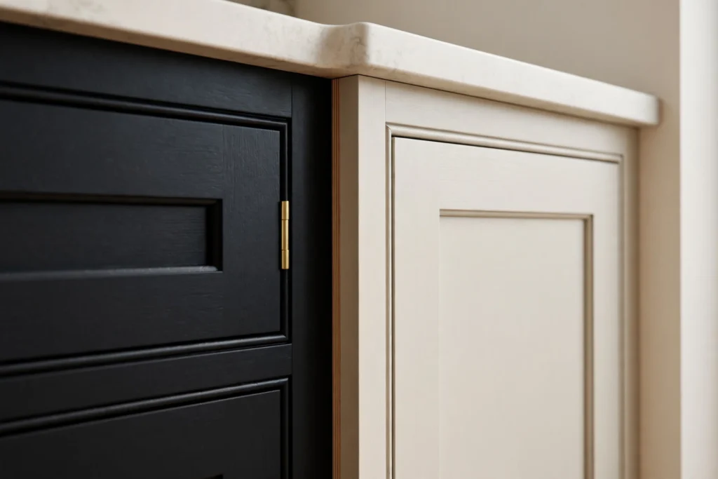
Rule 4: Keep hardware consistent. Same hardware finish on both colors. Mixed hardware + mixed colors = visual chaos. The hardware is the thread that ties the two tones together.
Rule 5: Three colors max, and that includes counters. Two cabinet colors + countertop + backsplash + floor is already a lot. If your counters are busy granite, keep the cabinet pairing simple. If the cabinets are the statement, keep counters quiet.
Rule 6: The colors must relate. They don’t have to match, but they need a relationship — same undertone family, complementary contrast, or a deliberate neutral-plus-color pairing. Random colors that happen to be on sale together look random.
The Best Two-Tone Color Combinations
These are the pairings that work reliably, ranked roughly by popularity:
Navy island + white perimeter — the undisputed champion. Dramatic focal point, bright room, timeless contrast. Brass hardware takes it to luxury; matte black keeps it modern. Full details in our blue kitchen cabinets guide.
Black island + white perimeter — bolder than navy, more modern-farmhouse. Needs good lighting; stunning with brass and marble-look counters.
Dark gray/charcoal lowers + white uppers — sophisticated, slightly softer than black. Our gray kitchen cabinets guide covers the shade selection.
Wood island + painted perimeter — the warmth play. White oak or walnut island with white or light gray perimeter cabinets. Gorgeous, current, and the wood adds texture that paint can’t.
Painted island + wood perimeter — the reverse, less common but beautiful: navy or green island anchoring warm wood perimeter cabinets.
Sage green lowers + white uppers — soft, earthy, very current. Less contrast than navy, more nuance.
Light gray island + white perimeter — the subtle two-tone. Barely-there contrast for people who want depth without drama. Safe, pretty, and nearly impossible to get wrong.
Navy lowers + white uppers (full perimeter) — for the committed: the whole lower run in navy, uppers in white. More dramatic than just the island; works in medium-large kitchens.
What to avoid: two bold colors together (navy + forest green fights for attention), two similar-but-not-matching neutrals (greige + beige looks like a mistake, not a design), and high-contrast pairings in tiny kitchens (visual busyness shrinks small spaces).
Where to Put Each Color: Placement Guide
The island (most popular): accent color on the island, main color on the perimeter. Works in any kitchen with an island. The island becomes furniture — a deliberate focal point.
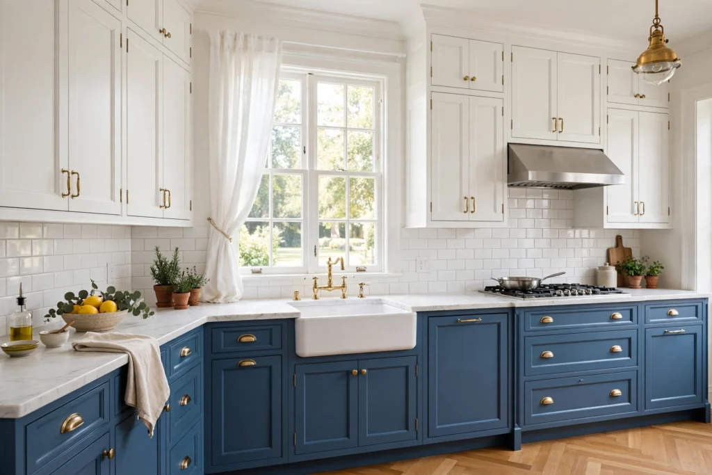
Uppers vs lowers: dark or bold color on lower cabinets, light/neutral on uppers. Grounds the kitchen, keeps it bright. Classic and foolproof.
Pantry/tall wall: a contrasting tall pantry cabinet or hutch section in the accent color creates a furniture-like moment — like a freestanding armoire. Beautiful in traditional and farmhouse kitchens.
Peninsula: same logic as the island — accent color on the peninsula, main color elsewhere.
Range wall: making the cabinets around the range (or the range hood surround) the accent color creates a natural focal point where the eye already goes.
The one placement I’d avoid: random accent cabinets scattered around the kitchen — one navy cabinet here, one there. Accents need a coherent zone (the island, the lowers, the pantry wall). Scattered = splotchy.
Two-Tone with Wood: The Warmth Combination
Mixing painted cabinets with natural wood is arguably the most sophisticated two-tone move:
- White perimeter + white oak island: bright, warm, current. The wood island feels like furniture.
- Navy perimeter + walnut island: moody luxury. For the bold and the well-lit.
- Light gray perimeter + natural maple island: soft, Scandinavian-leaning, serene.
- Wood lowers + white uppers: full-perimeter warmth below, brightness above. Rustic-modern.
The wood-tone rule: the wood should contrast clearly with the paint — medium oak against white, walnut against light gray. Wood that’s too close to the paint color looks like a mismatch rather than a choice. And keep the wood tone consistent — one wood species, not a mix.
Our wood kitchen cabinets guide covers species selection if you’re going this route.
What Does Two-Tone Cost?
Good news: two-tone is one of the cheapest upgrades in kitchen design.
- Same manufacturer, two standard finishes: often just a $200–$500 upcharge for the second finish setup, sometimes nothing at all. This is the smart way to do it.
- Custom color on the island only: if the perimeter is stock white and you want a custom navy island, you might order the island from a semi-custom line — the island alone in semi-custom while the perimeter stays stock. Total premium: maybe $1,000–$2,000 over all-stock.
- DIY two-tone: paint just the island yourself — $100–$200 in quality cabinet paint and a weekend. The highest-ROI two-tone move in existence if your island is currently the same color as everything else.
My honest take: if budget is tight, do the perimeter in stock white and splurge selectively on the island — better wood species, custom color, nicer detailing. The island is the piece everyone looks at; the perimeter just needs to be clean and bright. Nobody ever said “wow, look at those perimeter cabinets.”
Full pricing context in our kitchen cabinet costs guide.
Two-Tone Mistakes to Avoid
- 50/50 split. Looks accidental. Commit to a dominant color (70/30).
- Dark uppers, light lowers. Top-heavy and unsettling. Dark goes low.
- Clashing undertones. Cool gray island + warm cream perimeter = both look dirty. Match undertones.
- Too many colors. Two cabinet colors is the design; three is a circus. Count your countertop and backsplash in the palette.
- Accent without a zone. A single contrasting cabinet floating among matching ones looks like a replacement, not a design choice.
- Ignoring the backsplash. The backsplash sits between uppers and lowers — with two-tone, it needs to bridge both colors. A backsplash that matches only one tone emphasizes the divide awkwardly. Simple, neutral backsplashes bridge best.
- Forgetting resale. Bold two-tone (emerald + black, say) narrows your buyer pool. Navy/white, gray/white, and wood/white are all resale-safe. If you’re selling soon, keep the accent classic.
Frequently Asked Questions
Are two-tone kitchen cabinets going out of style? The specific trendy executions cycle, but the concept — contrasting island or uppers/lowers — has been around in various forms for decades and isn’t going anywhere. It’s crossed from trend to established design option, like the kitchen island itself did.
What is the most popular two-tone combination? Navy or dark blue island with white perimeter cabinets, by a wide margin. Followed by black island + white perimeter, and wood-tone island + white or light gray perimeter.
Should the island be darker or lighter than the cabinets? Darker, in the vast majority of cases. A darker island anchors the room and creates a focal point; a lighter island in a dark kitchen can work, but dark-island/light-perimeter is the proven formula.
Can you do two-tone with stock cabinets? Yes — most stock lines offer multiple finishes, and ordering the island in a second stock color is straightforward. The limitation is shade choice (you’re picking from their menu), not the concept itself.
Do two-tone cabinets cost more? Slightly — typically a $200–$500 upcharge for a second finish from the same manufacturer. If the accent cabinets come from a different (higher) tier, the premium is whatever that tier jump costs for those cabinets only.
How do I choose which color goes where? Default formula: light/neutral on the perimeter (70%), dark/bold on the island or lowers (30%). Dark goes low, light goes high. Hardware stays consistent across both. When in doubt, white perimeter + colored island — it’s popular because it works.
The Bottom Line
Two-tone kitchen cabinets are the rare trend that’s also just good design — more depth, more personality, a custom feel, for minimal extra cost. Follow the rules (70/30 split, dark low/light high, consistent hardware, related colors), pick a proven combination like navy + white or wood + white, and you’ll get a kitchen that looks designed rather than decorated.
Explore the colors: white kitchen cabinets, blue kitchen cabinets, gray kitchen cabinets, and wood kitchen cabinets. And if you’re still planning the whole project, start with our complete kitchen cabinets buying guide.